
Owning the randomness of creative endeavour
Do you ever find that your creative projects take you to unexpected places? I get that all the time. It’s one of the reasons I’m a ‘pantser’ rather than a ‘plotter’ in my fiction writing. When I start writing a story, I never know how it’s going to end.
I don’t want to know yet: I’m telling myself a story. If it turns out okay, I’ll refine it and tell it to others. The ones which turn out too odd, too personal or too grim — I keep those to myself.
Thus also in the visual arts. In woodcarving I had many ‘happy accidents’ where the timber ‘wanted’ to go in a different direction to where my eye and hand directed the gouge or chisel to take it. (Some unhappy ones too, of course. We don’t talk about those.)
Last night I was exploring ideas for a masthead to my new monthly newsletter for Tall and Tiny Tales — my Substack fiction project.

My initial aim had been to send out one story a week and nothing else, cognisant of how little I appreciate inbox clutter myself.
However I soon realised that I wanted to reach out to my subscribers occasionally through other channels — not just stories without commentary. I put out a survey and was delighted to find that most respondents ‘would’ read a monthly newsletter, a few ‘might’ and none ‘wouldn’t’.
Apparently my subscribers want to hear more from me. I’m actually quite touched by this.
So anyway, now we need a masthead. I wanted a mix of typography, echoing the look of my substack logo, and something personal, graphical.
I’ve never bothered to learn Photoshop or Illustrator properly, but I know some things I can do there. The results are a little random, but that’s not always a bad thing.
I’d already used this photo as the basis for an avatar elsewhere:
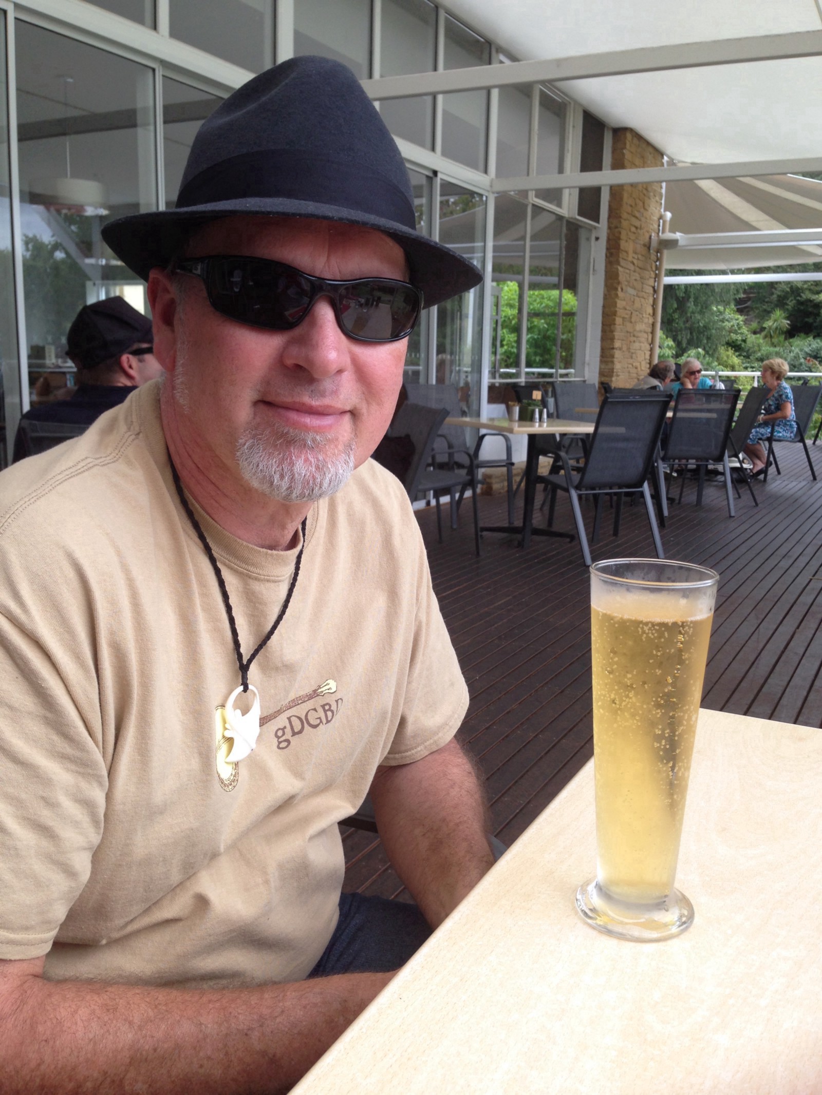
I though it might make a neat image for the masthead. Identifiably me, but not too much so. This is a newsletter, not an autobiography.
So I cropped it in MacOS Photos, put a ‘noir’ filter on it and messed around with the exposure and other settings to increase the contrast:
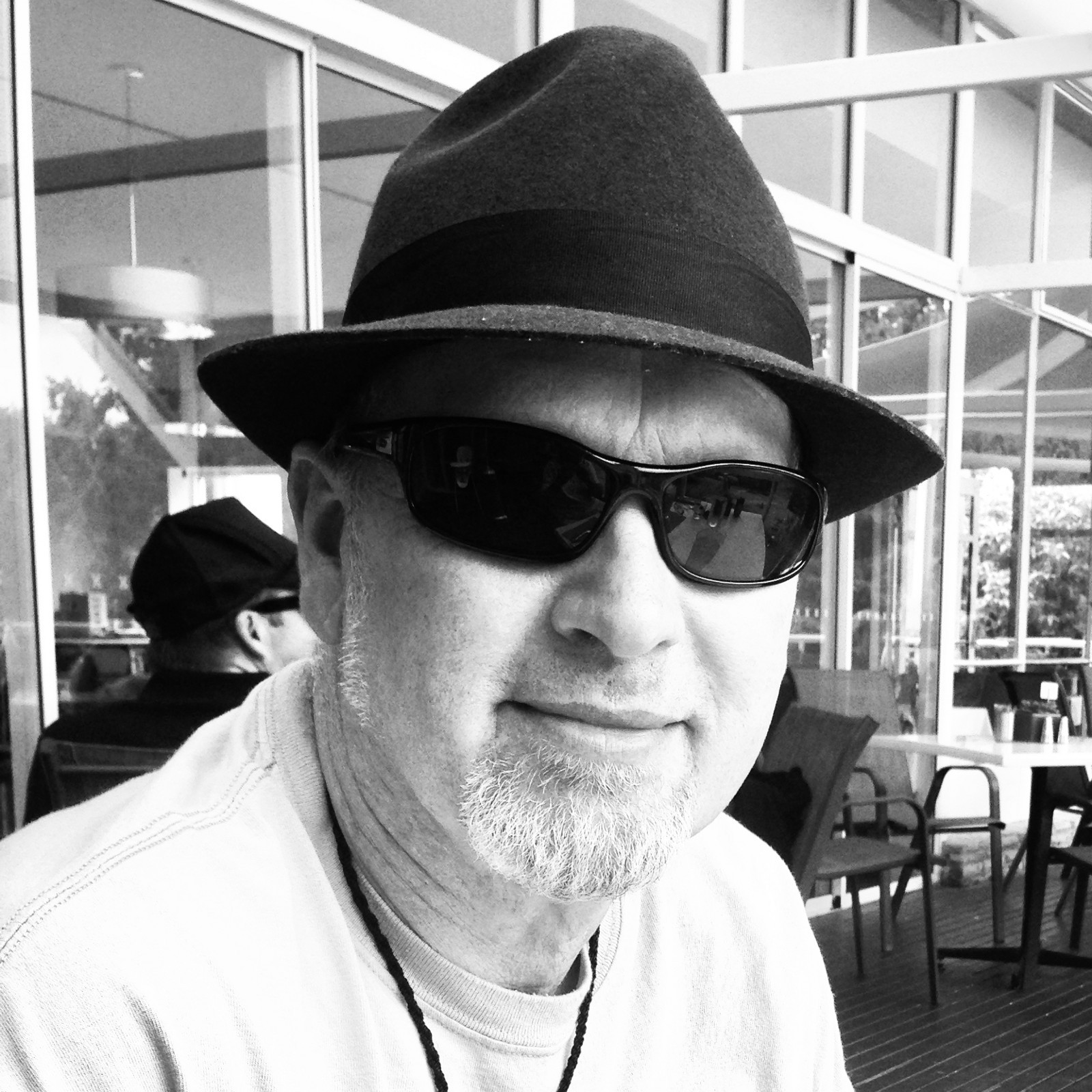
Okay, so now I’m looking like a Danish TV detective. What next?
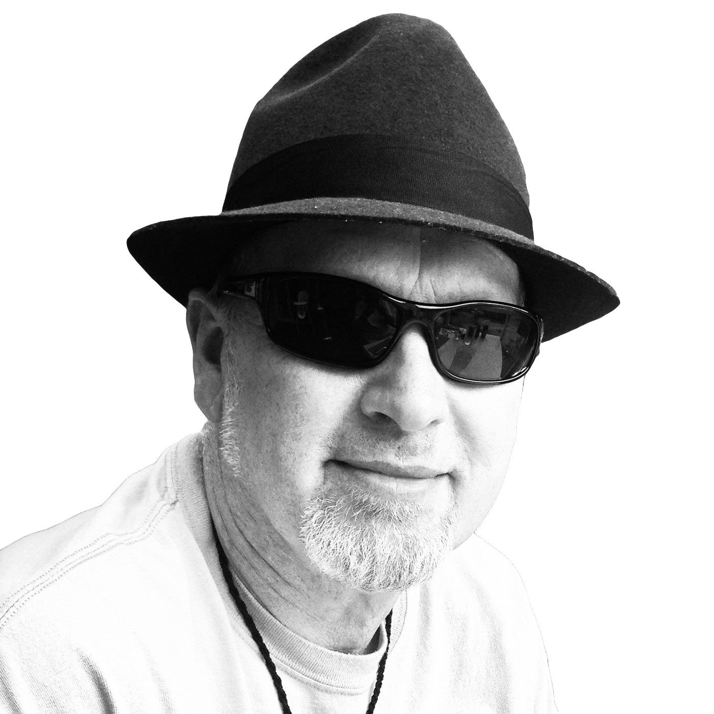
We drag-n-drop the photo into Photoshop. Now we’ll create a subject mask and turn it into a new layer, then knock out the background completely.
For a change, it works first go! No tedious tweaking with adding and subtracting areas of different tones.
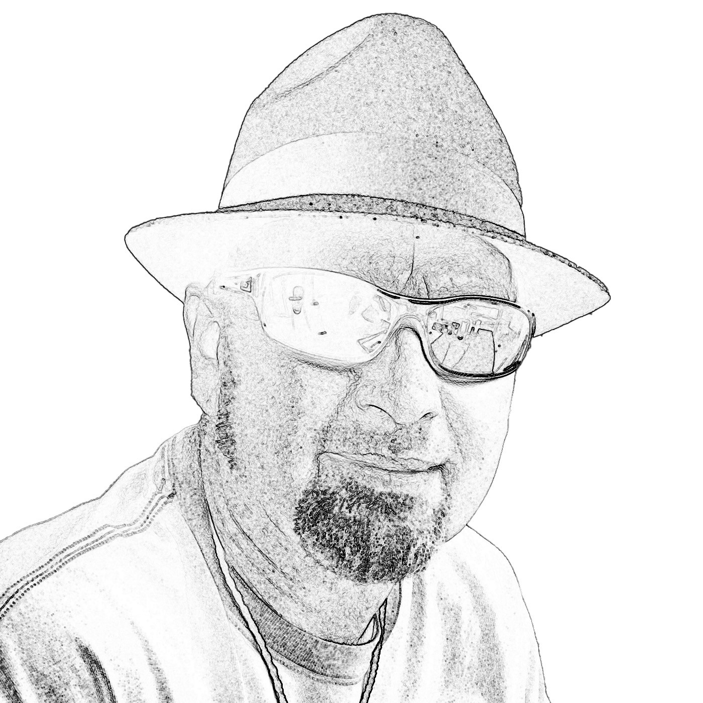
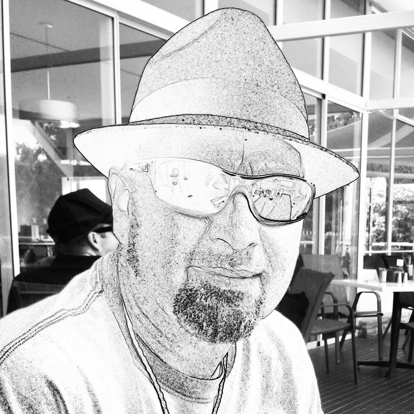
Hmm. How about a filter now? I try ‘liquify’. It makes me feel a little nauseous. What about ‘find edges’?
Whoa! That really pops! Look at them shades, dude! And my beard’s got its colour back!!
My wife says it looks like Telly Savalas. I’m not sure if that’s a good thing. (Who knows what fantasies she might have been entertaining about the dome-headed one?)
Okay, into Illustrator now. Let’s draw a curvy path, create text on that path, muck around with the point size and kerning to get it looking real snappy.

But the fun bit is combining the text and image:
I like this because text and logo together have a strong shape. It has impact and says something about the nature of the publication.
Then I go back a few steps, just out of curiosity. It’s nearly 11 p.m. and staying up much later will not be good for continued marital harmony. But I just have to try putting that background back in:
This image, the chance product of some idle mucking around, is a poignant one for me — because this is exactly how I tend to feel in company (or the company of more than one or two people). There, but, kinda … not there. On the outside, looking in.
It’s a good vantage point for a writer. Not always a great one for a human being. Can you relate to that, fellow creative person?
Thanks for reading!
Steve publishes two weekly storyletters on Substack:
- Tall and Tiny Tales — in your inbox every Tuesday (free sign-up)
- Friday Novella — something longer for the weekend (paid subscription)
Steve has also published lots of short stories and quite a few random meanderings on Medium.

Great masthead ❤️
LikeLiked by 1 person
Thanks, Jill!
LikeLike